Understanding the 404 Landscape
A 404 error is the internet’s way of saying, “Sorry, the page you’re looking for doesn’t exist.” This digital dead end occurs when a user attempts to access a page that the server can’t find. It’s a moment of disconnect, a virtual shrug that leaves users momentarily lost in the vast terrain of the web.
Encountering a 404 error can evoke frustration and confusion. Users expect a seamless journey through the digital landscape, and a missing page disrupts that flow. The default 404 page, often generic and uninspiring, does little to ease this frustration.
However, the savvy website owner views these detours as untapped opportunities. Understanding the 404 landscape goes beyond recognizing it as a roadblock—it’s about transforming it into an unexpected scenic route. A well-crafted custom 404 page can shift the narrative from frustration to engagement.
The default 404 page is like a blank canvas waiting to be painted. Customizing this canvas serves multiple purposes. It’s a chance to infuse your brand personality, guide lost users back on track, and even convert unexpected visitors into loyal followers. It’s an opportunity to turn an ordinary error into an extraordinary experience.
User experience is paramount in the digital realm. A custom 404 page allows you to craft an experience that is not just apologetic but empathetic. Acknowledge the detour, assure users, and provide clear paths to get back on their intended journey.
Understanding the 404 landscape requires delving beneath the surface. It’s about fixing broken links and leveraging these moments to enhance user engagement. By incorporating creative design elements, engaging copywriting, and interactive features, you can transform a user’s frustration into a memorable interaction.
The journey doesn’t end once your custom 404 page is live. Use analytics as your compass to navigate this landscape. Monitor user behavior, track interactions, and continuously improve. The 404 page is a dynamic space that evolves based on how users respond to the unexpected detour.
Why Bother with a Custom 404 Page?
Your website is an extension of your brand, and every interaction shapes the user’s perception. A custom 404 page is an opportunity to showcase your brand’s personality. Infuse it with colors, graphics, and a tone that aligns with your brand voice. It turns a moment of frustration into a chance for brand reinforcement.
When users encounter a default 404 page, they might feel lost and uncertain about where to go next. A custom 404 page, however, serves as a helpful guidepost. Incorporate clear navigation links, a search bar, or suggestions for popular pages. It’s about turning a stumbling block into a stepping stone back into the heart of your website. 
Consider this: a user lands on a non-existent page, and instead of frustration, they are greeted with a witty and engaging custom 404 page. Seize the opportunity! Add a call-to-action, highlight promotions, or offer exclusive discounts. Turn a potential bounce into a conversion opportunity.
User experience is the cornerstone of a successful website. A custom 404 page demonstrates your commitment to providing a positive experience, even in moments of error. It’s a chance to empathize with users, apologize for the detour, and guide them back on track with a touch of creativity.
When users encounter a standard 404 page, the likelihood of bouncing away increases. However, a custom 404 page with engaging visuals and relevant links can captivate users, reducing bounce rates. It transforms what could be a negative experience into an unexpected and memorable interaction.
From an SEO perspective, a well-crafted custom 404 page can contribute positively. By keeping users on your site and guiding them to relevant content, you minimize the impact of broken links on your search rankings. It’s a subtle yet effective way to maintain SEO integrity.
Beyond the technicalities, a custom 404 page contributes to your brand’s overall image. It reflects your attention to detail, creativity, and dedication to providing a seamless user experience. Users are more likely to forgive a detour if the journey is enjoyable.
A custom 404 page sets your website apart from the generic crowd. It’s an aspect of personalization that users remember. Make your 404 page a reflection of your uniqueness.
Creative Design Elements
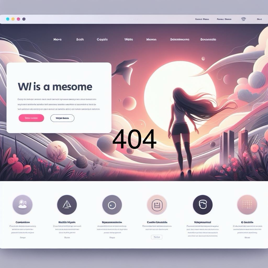
Break free from the monotony of a plain error message. Incorporate visually appealing graphics that align with your brand’s aesthetics. Visual elements add a touch of personality to your 404 page, turning it into a visually enticing destination.
Infuse a dose of humor and wit into your 404 page with engaging illustrations. A quirky character or a clever visual metaphor can lighten the mood, making the user’s encounter with the error less frustrating. The goal is to elicit a smile and shift the perception from annoyance to amusement.
Colors evoke emotions and reinforce brand identity. Use an on-brand color palette to create a cohesive and visually appealing 404 page. Consistent colors align with your brand and also contribute to a polished and professional look, even in moments of error.
Typography is a powerful design element. Experiment with playful and creative fonts to convey your brand’s tone. Typography adds character to your 404 page, making it more memorable for users.
Elevate user engagement with interactive design elements. Consider incorporating quizzes, games, or interactive features that encourage users to explore your site further. Turning a moment of error into an opportunity for interaction can leave a lasting impression.
Animate your 404 page with subtle movements or delightful animations. Dynamic elements capture attention and create a sense of liveliness. Animation adds flair to your 404 design.
Ensure that the imagery on your 404 page aligns with your overall brand image. Consistency in visuals reinforces brand identity and helps users feel a sense of familiarity even when encountering an error. A well-branded 404 page contributes to a seamless user experience.
Creative design goes hand in hand with messaging. Craft clear and friendly copy that acknowledges the error, apologizes for the inconvenience, and guides users back on track. A harmonious blend of visuals and messaging ensures a cohesive and delightful user experience.
Keep things fresh by introducing seasonal or themed variations to your 404 page. Themed variations add an element of surprise and keep your 404 page dynamic.
Engaging Copywriting
Words matter, and your 404 page copy can make all the difference. Craft a friendly and empathetic message that acknowledges the user’s detour while subtly guiding them back on track. Consider injecting a bit of humor—lightening the mood can ease the frustration.
A lost user needs direction. Provide clear and intuitive navigation options on your custom 404 page. Include prominent links to your homepage, popular pages, or a site search. The goal is to guide users seamlessly back into the heart of your website. Use your 404 page to showcase popular content, latest promotions, or even an exclusive discount code as a consolation prize for the accidental detour. Transform a dead-end into a crossroads of possibilities.
Engagement is key. Incorporate interactive elements like quizzes, games, or a clever ‘404 Challenge.’ Encourage users to interact and explore your site further. It’s an unexpected twist that can leave a lasting impression.
Your custom 404 page is a work in progress. Use analytics to track user behavior on this page. Are they bouncing away, or are they taking advantage of your cleverly placed links? Analyze and adapt. Your 404 page can evolve based on user interactions.
